Remaking a Game Menu
How it started
This project was a reimagining of the menu system that I helped build for the indie PC game Agency - The Deckbuilding Cardgame, back in 2014. I wanted to do this redesign to personaly chalenge myself to incorporate my new learnings into this old project.
Roles for this project: UX and UI designer (Me)
The problem with the original
The original menu for the game were developed by me (as lead artist/ UI designer) and a team of three more people in the programming and design department. Where I was responsible for developing a visual profile for the game.
Over the course of the development of the original menu, there were several problems that were revealed by testing.
Including:
The layout is generally confusing to players
The space is not optimally used.
It is not clear what functions are ascribed to buttons
It is hard to tell at a glance what information is important
There is a lack of a consistent visual hierarchy.
The purpose of this redesign is to solve these problems.
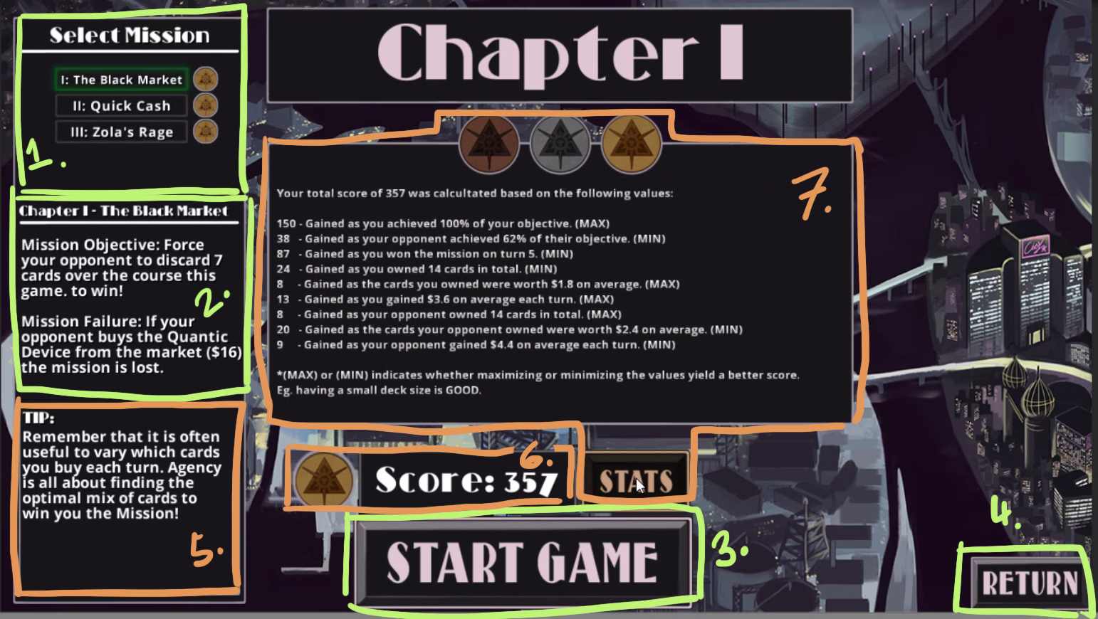
Understanding the old Layout
The original menu had all information located on a single screen and the elements of the original menu is broken down as follows:
(green for essential functions, orange for secondary):
The Select Mission screen
Mission information; win/lose criteria
"Start game" button
"Return" button
Game tip section
Hi score display
Expandable statistics screen
Tools
This project was created using Adobe XD, Illustrator, Photoshop and paper and pen.
The process
Sketches
I prefer to start every design process with sketching. For this project it provided a fast and efficient way of mapping out the layout of the new menu.
At this stage the main purpose was to ideate and to find as many different solutions as possible to the layout and structure of the main features.
The main difference between the different versions were:
If the features were located over one or two pages.
How the Mission information tied into the Mission select menu.
The location of the game map.
In the end I chose a version that:
Had the Features spread out over two pages.
Had the mission information and mission related stats and information on the second page to cluster them together (as related features).
Used the game map to accentuate the location of the different chapters to ad visual interest and flavor to the Select menu.
Has the game tip section on a separate loading screen.
Wireframes
Early on I created simple low fidelity wireframes in order to test the functionality of the design using Adobe XD.
At this stage the most important aspects was functionality and ease of use. In order to test for that the wireframes needed:
A visual hierarchy
An easy to understand layout
A loading and menu screens were also included to provide context to the testers.
Making it Inclusive!
As someone that have contract some minor work related injuries that give me some problems playing certain games for extended periods. Inclusivity is a very important subject to me.
Therefor the new menu system is optimized to be usable without a mouse and can be operated with a keyboard alone. To allow navigation for players with limited range of mobility or lack of fine motor skills.
Building the UI
In this phase I tested many different fonts and color combinations in order to find a suitable, visual expression for the game. I worked on this in Adobe XD to keep the wireframes low fidelity for as long as posible, to avoid going into the details of the design in this stage.
It was important to me to keep in mind some of the distinguishing features of the original to maintain recognizability.
These were:
A dark backdrop with light text.
Highlighted borders and buttons
Color ascents
The Result
The Visuals
The final result of this project was a design with a dark slate background that used a light grey mid tone to frame or/and display less important information. While white was used for headers, highlights and important details. Important buttons and accents uses a dark magenta with light borders.
The font used was Josefin Sans. It was was selected specifically to pay omage to the games previous take on art nouveau and detective noir influences.
Learnings and Final Thoughts
Something that did not come up during the testing of this prototype, but that will be of great importance when playing the actual game is that: There need to be a summary of each mission on the Mission select (perhaps using a drop down, expandable panel). To let players easily find the mission they are looking for, without going into the Mission information screen. If not properly addressed this has the potential to be a big cause of frustration for players further down the line.
That this did not come up during testing reminded me that it is important to test in an as life-like scenarios as possible. And to keep testing continuously during implementation, to avoid these kind of mistakes.


